7.2 Exploring GWAS association statistics#
Genome-wide association studies typically consist of performing a regression test for each variant to test it for association with a phenotype.
For instance, we would like to test if a particular SNP (with alleles “A” and “T” in the population) is associated with height. We would look at many people, and record the SNP genotype (AA=0, AT=1, or TT=2) and height for each person. Then, we’ll just do a linear regression to test if there is a linear relationship between \(X\) and \(Y\).
Understanding GWAS output requires some basic intuition about linear regression, p-values, and effect sizes. Here, we’ll explore these concepts and a useful tool, QQ-plots, for visualizing p-value distributions.
7.3.1 Framework for simulating and performing association tests#
First, let’s build some functions that will allow us to simulate associations between SNPs and a theoretical quantiative phenotype. We will use the following functions below:
SimulateGenotypes(maf, N)simulates an array of randomly generated genotypes for \(N\) people using specified minor allele frequency \(maf\).SimulatePhenotypes(gts, Beta)simulates phenotypes based on a set of input genotypes and an effect size \(\beta\) using the simple linear model:
where:
\(y_i\) is the phenotype of person \(i\)
\(x_i\) is the genotype (0, 1, or 2) of person \(i\) for the SNP of interest
\(\beta\) is the effect size, which gives a measure of how strongly the SNP is associated with the trait. We will require this to be between -1 and 1.
\(\epsilon_i\) is a noise term. You can think of it is the part of the trait explained by non-genetic factors, such as environment or measurement error.
Run the cell below. You can play around with changing \(N\), \(\beta\), or \(maf\) to see how the association plot changes.
%pylab inline
import numpy as np
import seaborn as sns

# Simulate genotypes for N samples with minor allele frequency maf (assuming HWE)
def SimulateGenotypes(maf, N):
    gts = []
    for i in range(N):
        gt = sum(random.random() < maf)+sum(random.random() < maf)
        gts.append(gt)
    # Technical note: scale to have mean 0 var 1
    gts = np.array(gts)
    gts = (gts-np.mean(gts))/np.sqrt(np.var(gts))
    return gts

# Simulate phenotypes under a linear model Y=beta*X+error
def SimulatePhenotype(gts, Beta):
    if Beta<-1 or Beta>1:
        print("Error: Beta should be between -1 and 1")
        return [None]*len(pts)
    pts = Beta*gts + np.random.normal(0, np.sqrt(1-Beta**2), size=len(gts))
    return pts

# Simulate an example association
N = 1000 # sample size (number of people)
Beta = 0.5 # Effect size
maf = 0.2 # Minor allele frequency
gts = SimulateGenotypes(maf, N)
pts = SimulatePhenotype(gts, Beta)

fig = plt.figure()
fig.set_size_inches((8, 4))

# Plot the distribution of phenotypes, should be normal-looking
ax = fig.add_subplot(121)
ax.hist(pts, alpha=0.5)
ax.set_xlabel("Phenotype")
ax.set_ylabel("Frequency")

# Plot the association
ax = fig.add_subplot(122)
ax = sns.boxplot(x=gts, y=pts, whis=np.inf)
ax.set_xlabel("Genotype")
ax.set_ylabel("Phenotype");
ax.set_xticklabels(["AA","AT","TT"])
fig.tight_layout()
---------------------------------------------------------------------------
ModuleNotFoundError                       Traceback (most recent call last)
Cell In[1], line 1
----> 1 get_ipython().run_line_magic('pylab', 'inline')
      2 import numpy as np
      3 import seaborn as sns

File ~/miniconda3/envs/jbook/lib/python3.12/site-packages/IPython/core/interactiveshell.py:2480, in InteractiveShell.run_line_magic(self, magic_name, line, _stack_depth)
   2478     kwargs['local_ns'] = self.get_local_scope(stack_depth)
   2479 with self.builtin_trap:
-> 2480     result = fn(*args, **kwargs)
   2482 # The code below prevents the output from being displayed
   2483 # when using magics with decorator @output_can_be_silenced
   2484 # when the last Python token in the expression is a ';'.
   2485 if getattr(fn, magic.MAGIC_OUTPUT_CAN_BE_SILENCED, False):

File ~/miniconda3/envs/jbook/lib/python3.12/site-packages/IPython/core/magics/pylab.py:159, in PylabMagics.pylab(self, line)
    155 else:
    156     # invert no-import flag
    157     import_all = not args.no_import_all
--> 159 gui, backend, clobbered = self.shell.enable_pylab(args.gui, import_all=import_all)
    160 self._show_matplotlib_backend(args.gui, backend)
    161 print(
    162     "%pylab is deprecated, use %matplotlib inline and import the required libraries."
    163 )

File ~/miniconda3/envs/jbook/lib/python3.12/site-packages/IPython/core/interactiveshell.py:3719, in InteractiveShell.enable_pylab(self, gui, import_all, welcome_message)
   3692 """Activate pylab support at runtime.
   3693
   3694 This turns on support for matplotlib, preloads into the interactive
   (...)
   3715     This argument is ignored, no welcome message will be displayed.
   3716 """
   3717 from IPython.core.pylabtools import import_pylab
-> 3719 gui, backend = self.enable_matplotlib(gui)
   3721 # We want to prevent the loading of pylab to pollute the user's
   3722 # namespace as shown by the %who* magics, so we execute the activation
   3723 # code in an empty namespace, and we update *both* user_ns and
   3724 # user_ns_hidden with this information.
   3725 ns = {}

File ~/miniconda3/envs/jbook/lib/python3.12/site-packages/IPython/core/interactiveshell.py:3665, in InteractiveShell.enable_matplotlib(self, gui)
   3662     import matplotlib_inline.backend_inline
   3664 from IPython.core import pylabtools as pt
-> 3665 gui, backend = pt.find_gui_and_backend(gui, self.pylab_gui_select)
   3667 if gui != None:
   3668     # If we have our first gui selection, store it
   3669     if self.pylab_gui_select is None:

File ~/miniconda3/envs/jbook/lib/python3.12/site-packages/IPython/core/pylabtools.py:338, in find_gui_and_backend(gui, gui_select)
    321 def find_gui_and_backend(gui=None, gui_select=None):
    322     """Given a gui string return the gui and mpl backend.
    323
    324     Parameters
   (...)
    335     'WXAgg','Qt4Agg','module://matplotlib_inline.backend_inline','agg').
    336     """
--> 338     import matplotlib
    340     if _matplotlib_manages_backends():
    341         backend_registry = matplotlib.backends.registry.backend_registry

ModuleNotFoundError: No module named 'matplotlib'
Now, let’s write a simple function to perform a GWAS based on a set of genotypes and phenotypes. Our function will take in a set of genotypes (\(X=\{x_1, x_2, ... x_n\}\)) and phenotypes (\(Y=\{y_1, y_2, ... y_n\}\)) and perform a linear regression between the two. We will output two things:
An effect size (\(\beta\)), which is the inferred slope of the regression line. The bigger the absolute value of \(\beta\), the more strongly the SNP is associated with the trait.
A p-value, quantifying how strongly we believe there is really an association. We’ll explore the p-value more deeply below.
import statsmodels.api as sm
# Perform a GWAS between the genotypes and phenotypes
def Linreg(gts, pts):
X = sm.add_constant(gts)
model = sm.OLS(pts, X)
results = model.fit()
beta = results.params[1]
pval = results.pvalues[1]
return beta, pval
N = 1000 # sample size (number of people)
maf = 0.2 # Minor allele frequency
Beta = 0.5 # Effect size
gts = SimulateGenotypes(maf, N)
pts = SimulatePhenotype(gts, Beta)
gwas_beta, gwas_pval = Linreg(gts, pts)
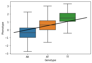
# Plot the association result
fig = plt.figure()
ax = fig.add_subplot(111)
ax = sns.boxplot(x=gts, y=pts, whis=np.inf)
ax.plot(gts, gwas_beta*gts, color="black") # GWAS linear regression fit
ax.set_xticklabels(["AA","AT","TT"])
ax.set_xlabel("Genotype")
ax.set_ylabel("Phenotype");
# Print out GWAS results
print("Beta: %s"%gwas_beta)
print("Pval: %s"%gwas_pval)
Beta: 0.5211089890019076
Pval: 5.53968088887613e-69
7.3.2 Computing P-values#
When performing a GWAS, we will get a p-value for each SNP that we test.
A p-value gives the probability that we would see a result as extreme as we saw even if our data was completely random. We can think of a p-value as a measure of surprise: if there was really no association between the SNP and the trait, what is the probability we’d see a line with this big of a slope?
Let’s use a little bit more formal definitions:
Null hypothesis (\(H_0\)): You can kind of think of the null hypothesis as “my data is just random”. For GWAS, our null hypothesis is that there is no association between a SNP and a trait. That is, that \(\beta=0\). This is opposed to the alternative hypothesis (\(H_1: \beta \neq 0\))
Test statistic: The thing we are testing. For GWAS, we are interested in the effect \(\beta\) of our SNP on the trait. Note \(\beta\) can be positive or negative. Close to 0 means no association, close to 1 means having more alternate alleles tends to increase the phenotype value, and the opposite for \(\beta\) close to -1. So let’s use \(|\beta|\) as our test statistic since we’re interested in finding extreme values, either positive or negative.
Null distribution: the distribution of the test statistic under the null hypothesis. You can think of a distribution just like a big list of numbers. For GWAS: the distribution of the \(\beta\) we measure given that there is actually no association.
p-value: The probability of observing a test statistic (\(\beta\)) as extreme as we did under the null hypothesis. For GWAS: what is the probability that even if there is no association (real \(\beta=0\)) I would measure \(\beta\) to be as large as I did?
While we could use math (think t-tests) to find p-values, we’ll instead use some simple simulations to get some intuition instead.
First, let’s generate an example null distribution for our GWAS example. Note, if you change the sample size (\(N\)) or MAF, this distribution could change! So leave those be for now.
The code below generates 10,000 “null” samples of betas. That is, the \(\beta\) values we would infer using linear regression even if the real value is \(\beta=0\).
N = 1000 # sample size (number of people)
maf = 0.2 # Minor allele frequency
num_tests = 10000 # Use this many tests to find the null distribution
gts = SimulateGenotypes(maf, N)
beta_null_dist = []

real_beta = 0 # null distribution!
for i in range(num_tests):
    pts = SimulatePhenotype(gts, real_beta)
    gwas_beta, gwas_p = Linreg(gts, pts)
    beta_null_dist.append(abs(gwas_beta))

fig = plt.figure()
ax = fig.add_subplot(111)
ax.hist(beta_null_dist, alpha=0.5, bins=50)
ax.set_xlabel("|beta|")
ax.set_ylabel("Frequency");
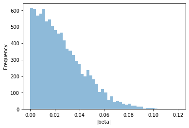
Note, even though we simulated \(\beta=0\), we still measured \(|\beta|>0\) a lot of the time! So in our real data, even if \(\beta>0\), we might not be that surprised, since we know we can get that result just by chance.
We can use this list of beta values, beta_null_dist, as our null distribution. Now, let’s use this null distribution to compute a p-value for an actual association.
The function ComputePval below to computes a p-value based on the null distribution we generated above. The p-value should give the percent of results in the null distribution that are greater than the observed value.
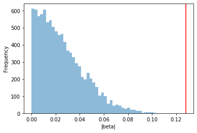
# Simulate data with a real beta > 0
N = 1000 # sample size (number of people). must be same as was used for generating the null!
maf = 0.2 # Minor allele frequency
real_beta = 0.1

# Function to compute p-value
# what percent of results in the null distribution are larger than obs_beta?
def ComputePval(null_dist, obs_value):
    pval = len([item for item in null_dist if item > (obs_value)])*1.0/len(null_dist)
    return pval

gts = SimulateGenotypes(maf, N)
pts = SimulatePhenotype(gts, real_beta)

# Perform association test
obs_beta, obs_pval = Linreg(gts, pts)

# Compute pvalue basedon comparison to the null
pval = ComputePval(beta_null_dist, abs(obs_beta))

# Visualize how our obs_beta compares to the null
fig = plt.figure()
ax = fig.add_subplot(111)
ax.hist(beta_null_dist, alpha=0.5, bins=50)
ax.set_xlabel("|beta|")
ax.set_ylabel("Frequency");
ax.axvline(obs_beta, color="red")

print("Linear regression p-value: %s"%obs_pval)
print("P-value from comparison to null distribution: %s"%pval)
Linear regression p-value: 3.3077120180260785e-05
P-value from comparison to null distribution: 0.0
"""Test p-value function"""
gts = SimulateGenotypes(maf, N)
for i in range(3): # test random simulations
    pts = SimulatePhenotype(gts, real_beta)
    obs_beta, obs_pval = Linreg(gts, pts)
    pval = ComputePval(beta_null_dist, abs(obs_beta))
    assert(abs(obs_pval-pval)<0.1)
How do you think your p-value above will be affected by increasing or decreasing the number of samples we are analyzing (\(N\))? If you have very few samples, will you be able to get significant p-values? What if you have 1 million samples? Play around with the code above.
7.3.3 Visualizing p-values#
In GWAS, we perform literally millions of different regression tests. By looking at the distribution of p-values across all of those tests, we can learn some basic diagnostic information about our GWAS to see if it is giving us reliable results.
First, let’s explore how p-values should be behaving under the null hypothesis that no SNPs in our data are associated with the trait. The code below performs 1,000 simulations of null data and computes the pvalue for each. It then visualizes the pvalues as a histogram.
N = 1000 # sample size (number of people). must be same as was used for generating the null!
maf = 0.2 # Minor allele frequency
num_snps = 1000

pvals_null = []

gts = SimulateGenotypes(maf, N)

for i in range(num_snps):
    pts = SimulatePhenotype(gts, 0)
    obs_beta, obs_pval = Linreg(gts, pts)
    p = ComputePval(beta_null_dist, abs(obs_beta))
    pvals_null.append(p)

fig = plt.figure()
ax = fig.add_subplot(111)
ax.hist(pvals_null, alpha=0.5, bins=np.arange(0, 1.05, 0.1))
ax.set_xlabel("P-value")
ax.set_ylabel("Frequency")
Text(0, 0.5, 'Frequency')
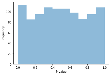
You should find that if all of our data is null, the p-values should mostly follow a uniform distribution! If there is no association in our data, the p-value is equally likely to be anywhere from 0 to 1. This is the very definition of a p-value.
Now let’s see what happens if most of our data is null, but some of it is not (in a real GWAS, the vast majority of SNP are not associated with our trait of interest. But a couple of them probably are.)
pvals_notnull = []

num_snps = 1000
frac_assoc = 0.05 # % of SNPs associated with the trait
maf = 0.2
gts = SimulateGenotypes(maf, N)

for i in range(num_snps):
    if random.random() < frac_assoc:
        beta = 0.3
    else: beta = 0

    pts = SimulatePhenotype(gts, beta)
    obs_beta, obs_pval = Linreg(gts, pts)
    p = ComputePval(beta_null_dist, abs(obs_beta))
    pvals_notnull.append(p)

fig = plt.figure()
ax = fig.add_subplot(111)
ax.hist(pvals_notnull, alpha=0.5, bins=np.arange(0, 1.05, 0.1))
ax.set_xlabel("P-value")
ax.set_ylabel("Frequency");
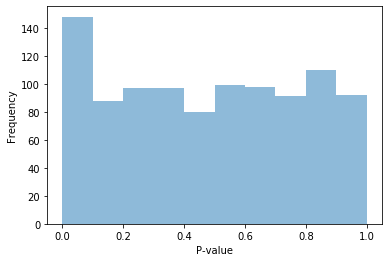
What happened to the distribution of p-values when some of our data is not null? You will likely see a big spike in the lowest p-value bin, corresponding to significant p-values. This means there are many more small (significant) p-values than we would have expected compared to if our data was completely random.
7.3.4 QQ plots#
Above we visualized p-value distributions using histograms. Another really useful tool for visualizing p-values is a QQ plot. QQ plots are generally used to compare distributions to each other. In our case, we’ll use them to visualize how a distribution of p-values we get from our GWAS compares to what we’d expect under the null hypothesis that no SNPs are associated with the disease.
Consider two distributions (lists) of data, with equal length. We’d like to know if these two distributions are the same (i.e. they have the same min, median, max value, but also all the other percentiles match too). To compare them, we will:
Step 1: Sort each list separately
Step 2: Make a scatter plot of one vs. the other.
If the two lists come from the same distribution, the scatter plot should follow the diagonal (x=y) line pretty well.
Let’s try generating a QQ plot to compare our list of pvalues from a bunch of null associations (pvals_null above) to the uniform distribution.
One important note is that for making QQ plots for p-values, we will work with -log10(p) since we care most about what’s going on with really small p-values. So in the QQ plots below, bigger number = smaller = more significant p-value.
def QQPlot(pvals):
    # Sort the observed p-values
    pvals.sort()
    # Generate numbers from a uniform distribution
    # Similar to https://www.rdocumentation.org/packages/stats/versions/3.6.2/topics/ppoints
    n = len(pvals)
    a = .375 if n<=10 else .5
    unif = (np.arange(n) + 1 - a)/(n + 1 - 2*a)

    # Make a QQ plot
    fig = plt.figure()
    ax = fig.add_subplot(111)
    ax.scatter(-1*np.log10(unif), -1*np.log10(pvals), s=5, color="black")
    ax.plot([0, 3], [0,3])
    ax.set_xlim(left=0, right=3)
    ax.set_ylim(bottom=0, top=max(-1*np.log10([item for item in pvals if item >0])))
    ax.set_xlabel("Expected -log10(P)")
    ax.set_ylabel("Observed -log10(P)")

QQPlot(pvals_null)
/opt/conda/lib/python3.6/site-packages/ipykernel_launcher.py:17: RuntimeWarning: divide by zero encountered in log10
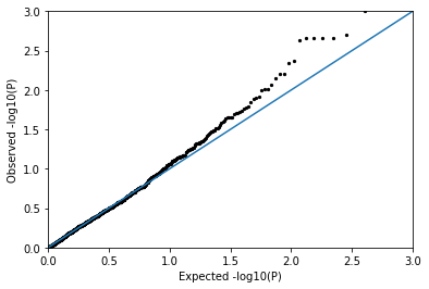
You should find that the null p-values follow the diagonal pretty well, meaning they look pretty uniformly distributed as expected!
Now let’s make a QQ plot using the p-values from pvals_notnull when some of our associations had non-zero \(\beta\).
QQPlot(pvals_notnull)
/opt/conda/lib/python3.6/site-packages/ipykernel_launcher.py:17: RuntimeWarning: divide by zero encountered in log10
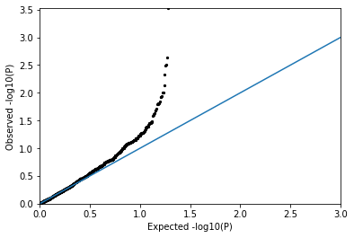
You should see many more points well above the diagonal, corresponding to a strong departure from the expectation under the null distribution! (i.e. there is a signal!)
7.3.5 Confounding factors#
For most traits we would look at with GWAS, the vast majority of the SNPs in the genome should have no association with the trait. Thus, we’d expect the QQ plot to follow the diagonal line for most of the data, and see a few significant associations at the far right of the plot.
In some cases, our trait could be affected by things other genetic factors, and if we don’t control our association tests for this it could end up making the p-values from our GWAS unreliable.
For example, say we are performing a GWAS for eye color, and our dataset consists of 50% people with European ancestry and 50% people with East Asian ancestry. Since blue eyes are much more prevalent in European populations, our GWAS will likely pick up a ton of genetic differences that just happen to be different between the population groups, and have nothing to do with eye color. If we don’t control for ancestry, we’ll end up with a ton of false positive associations in our GWAS.
The code below simulates the effect of a confounding factor such as ancestry and displays the resulting QQ plot.
N = 1000 # sample size (number of people)
Beta = 0.0 # Effect size. no real associations
popBeta = 0.1 # Confounding effect
maf = 0.2 # Minor allele frequency

def SimulatePopLabels(gts):
    poplabels = []
    for item in gts:
        if random.random() < item * 0.5: poplabels.append(0)
        else: poplabels.append(1)
    return np.array(poplabels)

def SimulatePhenotypeConfounding(gts, Beta, poplabels, popBeta):
    if Beta<-1 or Beta>1:
        print("Error: Beta should be between -1 and 1")
        return [None]*len(pts)
    pts = Beta*gts + popBeta*poplabels + np.random.normal(0, np.sqrt(1-Beta**2-popBeta**2), size=len(gts))
    return pts

num_snps = 1000
pvals_conf = []
gts = SimulateGenotypes(maf, N)
for i in range(num_snps):
    poplabels = SimulatePopLabels(gts)
    pts = SimulatePhenotypeConfounding(gts, Beta, poplabels, popBeta)
    obs_beta, obs_pval = Linreg(gts, pts)
    pvals_conf.append(obs_pval)
QQPlot(pvals_conf)
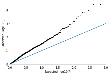
You should see a huge inflation in the p-values! There are way too many significant values. The p-values in this case are probably not very reliable.
When performing GWAS on real data, we’ll have to control for the potential confounding effects of ancestry. We’ll do this in tomorrow’s lab by including ancestry as a covariate in our regression analysis.
You are encouraged to play around with the code in this notebook by playing with parameters like \(N\), \(maf\), and \(\beta\) to see how that changes your p-value distributions.
7.3.6 Summary#
In summary, QQ plots can be a really useful diagnostic tool. If we perform a GWAS, and make a QQ plot from the pvalues, we might see a couple different scenarios:
The data mostly follows the null, but there are a handful of p-values that are way above the diagonal: good! As expected most SNPs are not associated, but a handful of associations look like they could be real. Generally, this is a sign that the GWAS worked and the p-values are reliable.
The data follows the diagonal (null): this could mean: (1) there really is no association between any SNPs in your data and the trait of interest (2) there may be associations but your data didn’t have enough power to pick it up, perhaps because you don’t have enough samples or (3) something else went wrong…
Almost all of the points are way above the diagonal. This could mean (1) there is some confounding factor like ancestry you’re not controlling for OR (2) there really are thousands of SNPs associated with the trait.
The lines are way below the diagonsl. This can happen but we probably won’t run into it. It could mean you didn’t have enough power so all of your p-values are way higher than expected even under the null.